
The Zorn palette: what it is and how it can be used
The zorn palette se refers to a color palette attributed to the great Swedish artist, Anders Zorn (February 18, 1860 - August 22, 1920). It consists of only 4 colors: ocher yellow, ivory black, vermilion and titanium white. Cadmium red light is commonly used in place of vermilion by modern artists.
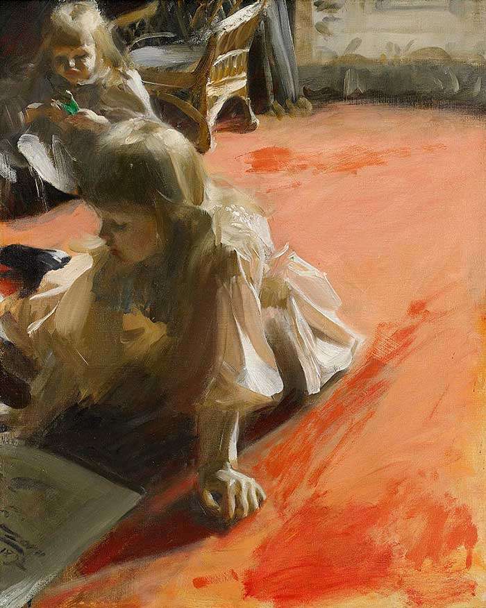
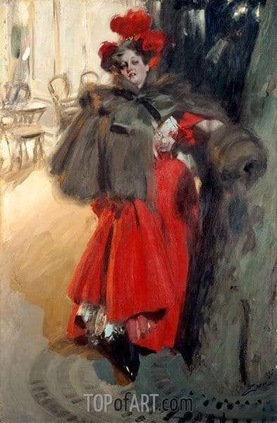
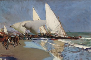
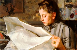
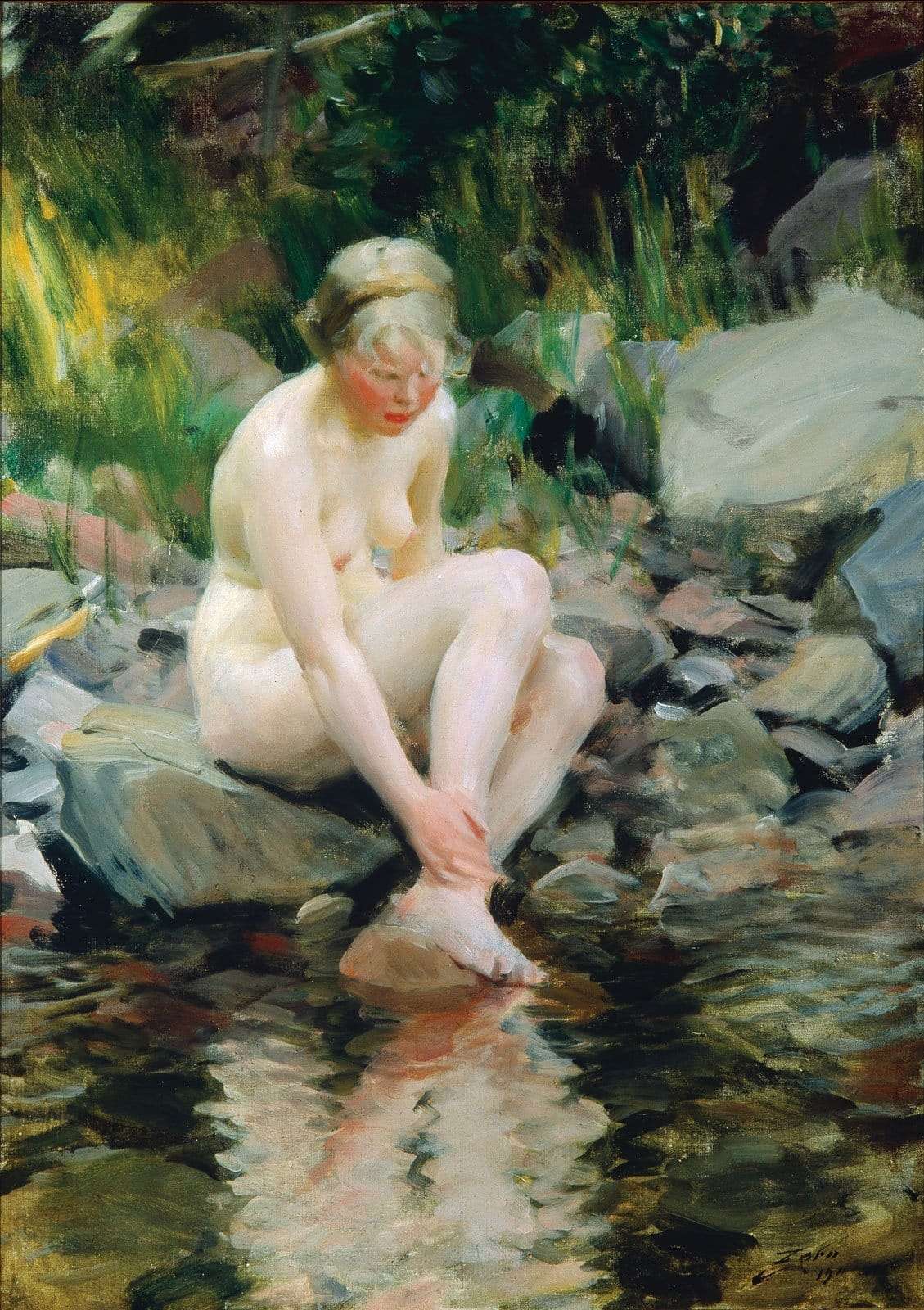
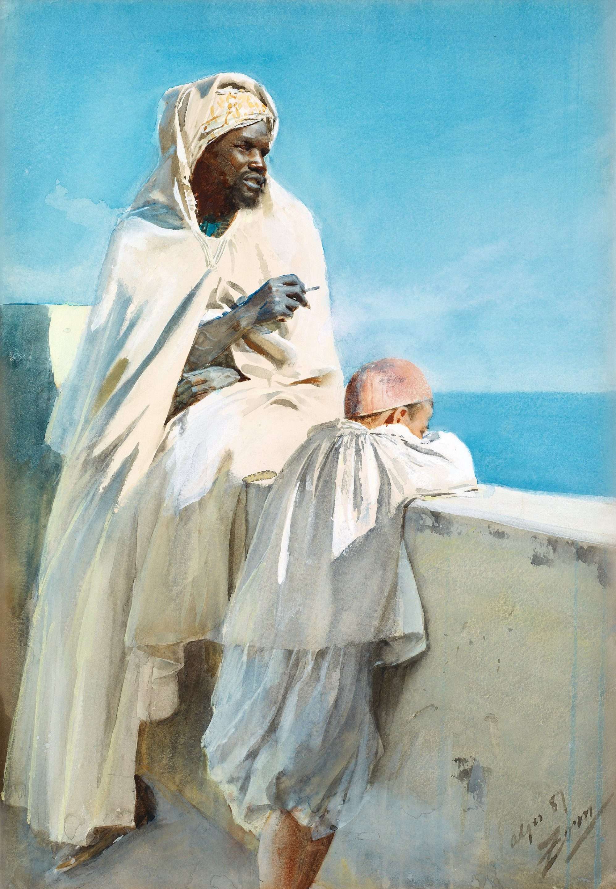
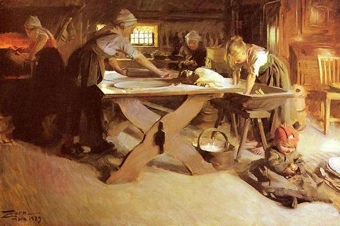
While this may seem like an extremely limited range of colors, Zorn demonstrated through his paintings what is possible with such a limited palette. These are some of his paintings that appear to use the Zorn palette:
Zorn Palette: Colors
How to mix colors in the Zorn Palette
This palette is certainly rich in history. It is made up of four basic pigments (ocher yellow, cadmium red, ivory black and white, of course). Some also add Vermillion, Viridian and / or Cerulean Blue. Whether or not it is true, the range of colors is much more limited than what most artists use today. It is believed that this palette is the result of the influence of the old "Palette of the Apelles".
- Black and white can be used for value changes.
- Ivory black is a relatively cool black and can be used as a very dark substitute for blue. In a very limited sense, you can think of ocher yellow, light cadmium red, and ivory black as a version of the primary colors. You can see these colors as an earthy version of these colors.
- Cadmium red light is the most saturated color on the palette. Outside of that, the Zorn palette doesn't stand out in vivid colors.
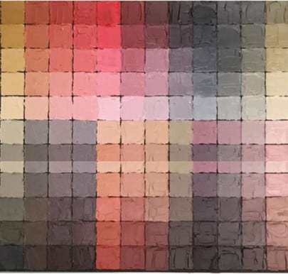
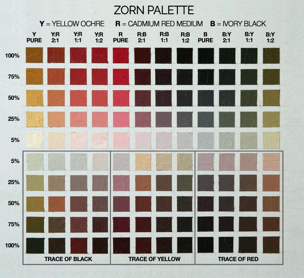
Zorn Palette Color Gamut
Below is a color chart showing the range of colors possible with the Zorn palette. The lack of blue seems to be the biggest limitation. The closest thing to blue is a cool gray. My first thought about this color gamut is that it would be perfect for capturing all subtle skin tones in portraits, but less so for capturing the wide range of colors needed in landscape painting. This makes sense since Zorn was one of the most acclaimed portrait painters of his day.
How to mix the colors?
Helpful guide to mixing colors
Zorn's reduced palette is a great help in learning how to mix colors successfully and quickly. Working with a limited palette forces you to continually mix colors to get the colors you need and although it is often difficult at first, after a few practice sessions you really begin to understand how to mix colors. In painting classes, especially for beginners, we provide you with a very useful guide to mixing colors. The guide allows them to analyze each color and understand the steps that must be followed to achieve it.
Is the Zorn palette a myth?
Myth or Reality
Some scholars have questioned the existence of the Zorn palette, drawing attention to:
- The obvious use of blue and green in some of his paintings.
- The tubes of paint that Zorn left in his studio, said to have included 17 tubes of cobalt blue.
But all of this really proves that he didn't strictly use the Zorn palette on every painting.
The paint tubes Zorn left behind have little meaning. I personally have tubes of paint in my studio that I haven't touched in years. It's difficult to determine which color palette I prefer to use based on the paint tubes currently in my studio. We all have those colors that seemed to be helpful, but they just end up collecting dust.
But there is a lot of evidence to suggest that he used the Zorn palette frequently.
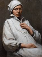
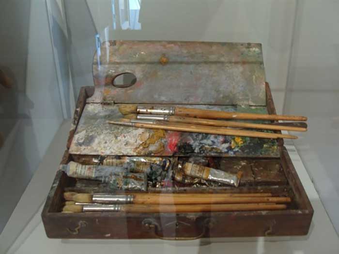
First, his actual palettes kept in museums indicate a favorable use of the 4 colors. There are hints of a few other colors, such as what appears to be cadmium yellow and viridian green, but the 4 colors in the Zorn palette occupy much more prominent positions.
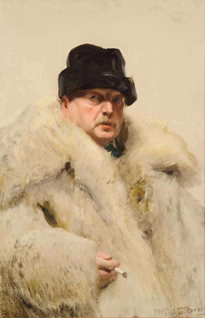
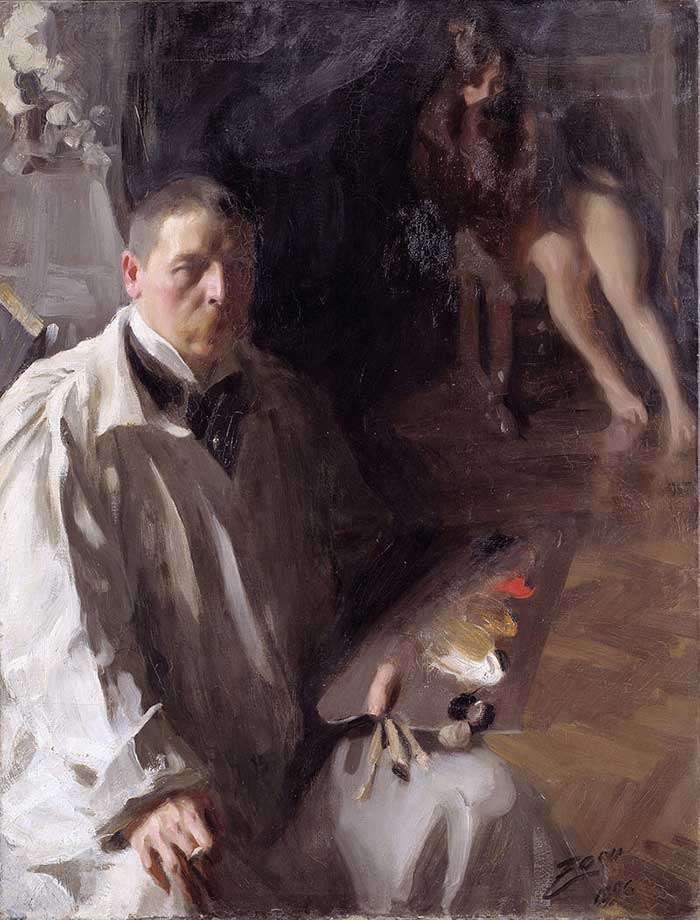
Second, there's this self-portrait that shows him painting with the Zorn palette.
Why use the Zorn palette?
Many art teachers (such as Jeff Watts of Watts Atelier) have found the Zorn palette to be a great learning tool for students, limiting the number of possible decisions but allowing a wide enough color gamut to create a painting. dazzling. The general idea is that a student should start with a monochrome (no color) palette, then progress to the Zorn palette, and finally to more complex color palettes.
When painting with such a limited color palette, you really have to learn to use value rather than color to emphasize shape. Value is believed to be the most important element of color, so it is important that you have a firm grasp of it before trying to handle more complex color palettes.
The cons of the Zorn palette
Obviously, there are some significant limitations of the Zorn palette, such as:
- There is no blue, so you are missing a wide range of colors. The closest thing to blue with this palette is a cool gray that you can get by mixing ivory black with titanium white.
- You cannot mix saturated greens or purples.
- The color saturation of the palette is generally very boring, so you should mainly work with browns and grays.
- It is not too suitable for landscape painting due to lack of color. Instead, the Zorn palette seems to be more suitable for portraiture.
Exercise with the Zorn paddle
Michael Lynn Adams proposes on its website a wonderful exercise that will help you understand and master the Zorn palette more easily. Here are the steps.
This exercise consists of creating a color chart where the basic Zorn limited palette of ocher yellow, cadmium red, and ivory black are systematically blended from fully saturated to lightly tinted white. The resulting graphic shows the remarkable range of colors you can get from this basic palette. I also discovered the beautifully harmonious color combinations that are created by using this palette.
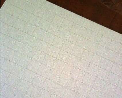
Step 1: Draw the Grid
On a canvas panel, draw a 3cm x 3cm grid of squares.
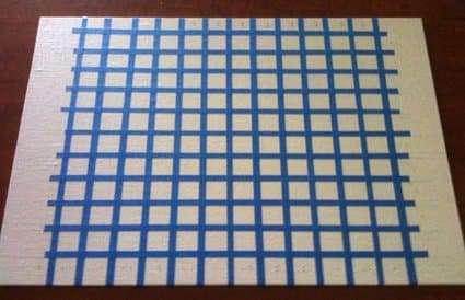
Step 2: glue the masking tape
Using masking or painter's tape, create squares where the mixed colors will go.
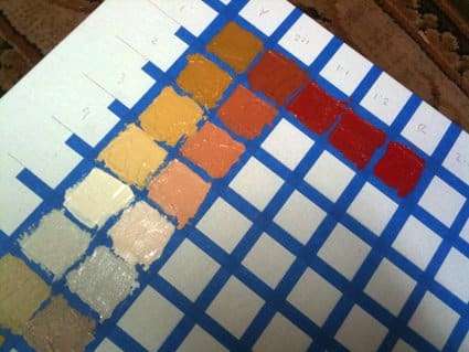
Step 3: Paint the Grid
Using a small putty knife or brush, paint the grid in the mixed colors as detailed below.
Color mixing in the Zorn palette
Top Row
In the top row and in the first box we put yellow, in the 5th box red and in the 9th box black, all without mixing.
In the middle boxes we mix the primary colors to establish a base of secondary colors. In this way, in the top row and in the 2nd box we mix a little yellow and a very little red (be careful with the red that stains a lot). In the 3rd box we mix a little yellow and a little more red and thus we continue adding the rest of the colors from the first row.
Rows 2nd, 3rd, 4th and 5th
Mix the white with the color at the top of each column. The goal is to create a progressively lighter 5-stage value for each color in the top row. On the left side of the guide is the approximate percentage of the top row color mixed with pure white for each row. Your goal is to create a gradual series from pure color to a light tint of the same color.
Last 5 rows
Here we explore tertiary colors. When using this limited palette, the tertiary color is mostly in the brown to pink family. The progression is the same as the top grid but with the addition of a third color. For example, in columns where ocher yellow and red were mixed, add a trace of ivory black. Mix just enough color to see a change in hue. You should also see a change in temperature as you add the third color.
Conclusion
Clearly the use of the Zorn palette or other limited palette helps students better understand color. Several art teachers, such as Jeff Watts, use the "Zorn palette" (sometimes substituting vermilion for cadmium red) as a teaching tool, because it provides students with a finite range of color options but wide enough to handle most paints.